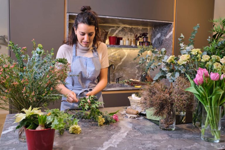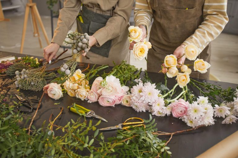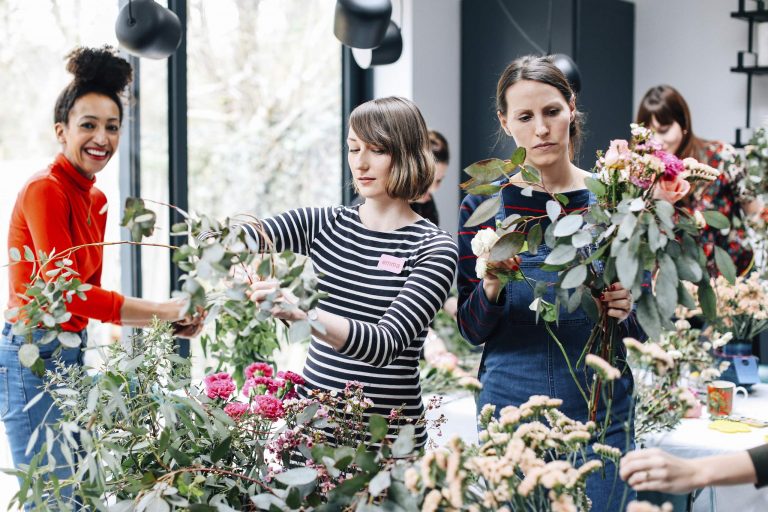
Color is an incredibly important part of floral design. It’s one of the first things that we take in when we encounter a new piece. It can set the mood of the piece and lead the viewer’s eye where you want it to go. It can be the element that makes everything come together, so it’s important that we think about color choices and use them to advantage. It’s easy to pick flowers that you like when you create an arrangement, but it’s more effective when you have a color palette in mind.
Use Related Colors
Before you pick out any flowers, think about what kind of atmosphere you want to create. Is it bold, subtle, romantic, fun? Have a couple of colors in mind — just two or three is enough for a good color scheme — and then your search for stems will be more focused. A good starting point is to pick flowers and foliage that share similar colors. Analogous or adjacent colors don’t compete with each other, and they provide a nice level of interest without being overwhelming. For a more subtle arrangement, try using only different tones of a single color. If you keep the foliage neutral, the shape of the flowers will have more impact than the color.
Introduce Contrast Carefully
Once you have a palette established, look for a few items that have contrasting hues, which can create interest or emphasize particular flowers. Too much contrast is distracting, though, because all of the elements in the piece compete for attention. So, introduce it in small doses, such as a single stem with unusual coloration, and use it to advantage. The overall design should have a clear color palette and dominant mood.
Think About Color Distribution
Be mindful of how the colors are distributed, because that affects how the piece looks. Instead of viewing the foliage as just a neutral backdrop, think of it as a part of your color palette. Using foliage that is different shades of green from one another can add interest, and foliage with a unique color can alter the mood of an arrangement.
The way that your colors are placed within the design determines its impact. Using a strong color in just one place creates an area of intense interest, but it can also feel unbalanced. Using a few different colors in just one area of the design creates a contrasting mood with the rest of the piece. Repeating a color in different areas of the arrangement balances the visual impact and leads the viewer’s eye through the entire piece. This makes the arrangement feel more cohesive and balanced. You can also use color to create areas of interest without using any additional objects. If you surround a particular flower with more subdued colors, that flower becomes the focal point.
Experiment With Different Palettes
Color can create different moods, so it’s helpful to experiment with various color palettes until you understand how they make people feel. You can create the same arrangement in a monochromatic, contrasting, and analogous color scheme to see how the color affects the mood. When you consider color palettes, think about the surrounding environment, too, as it can affect the mood of the arrangement. How does the piece interact with the background colors or furniture around it? Placing a floral arrangement on a beautifully set dining table can be as much about the table setting as the flowers.
Ultimately, color is just one tool in your floral design arsenal, and cohesive pieces use color, shape, texture, and scale equally. Floral arrangements can feel more dynamic when there’s an underlying structure, even if it’s just a color scheme that all of the pieces have in common.